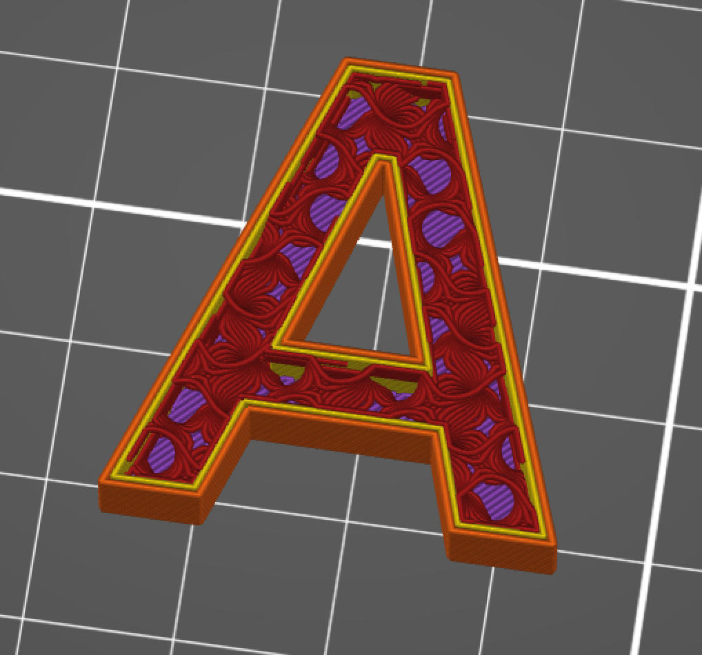
A Quick Infill Project
Everyone who has 3D printed something is at least vaguely aware of the concept of infill. Unless you want your 3D prints to be totally solid, you usually reduce the density of the center of the part, creating a number of solid layers around a central void. The percentage of this central void that is filled with material is known as the infill ratio. A lot of slicers will automatically pick some level of infill and some pattern to distribute the material in the most structurally sound way, but that doesn’t mean you have to stick to these settings. With some clever slicer settings, you can make the infill visible from the outside of the part, giving a unique artistic view into the inards of 3D printing.
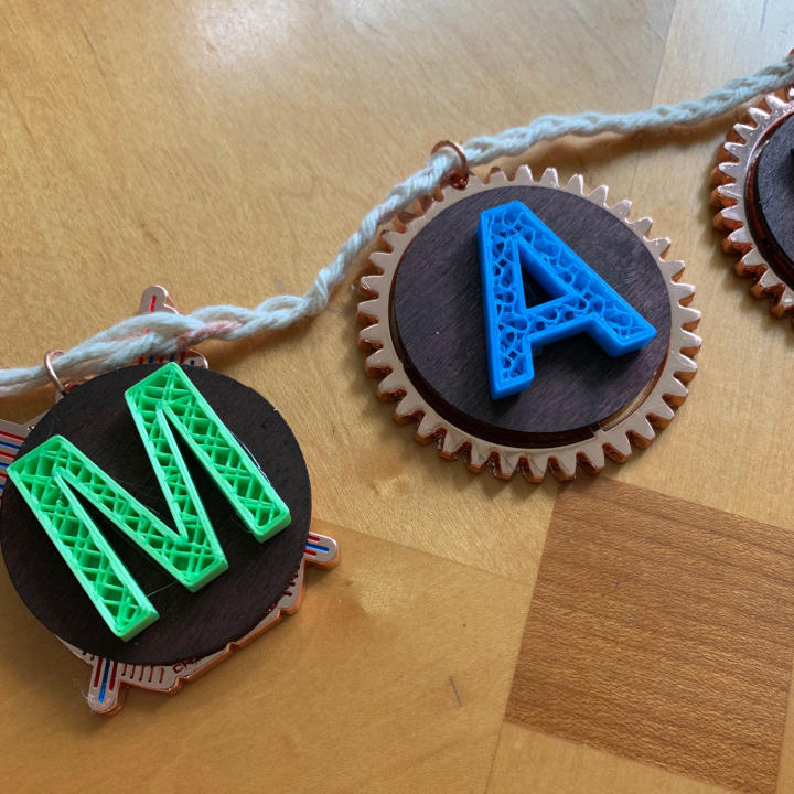
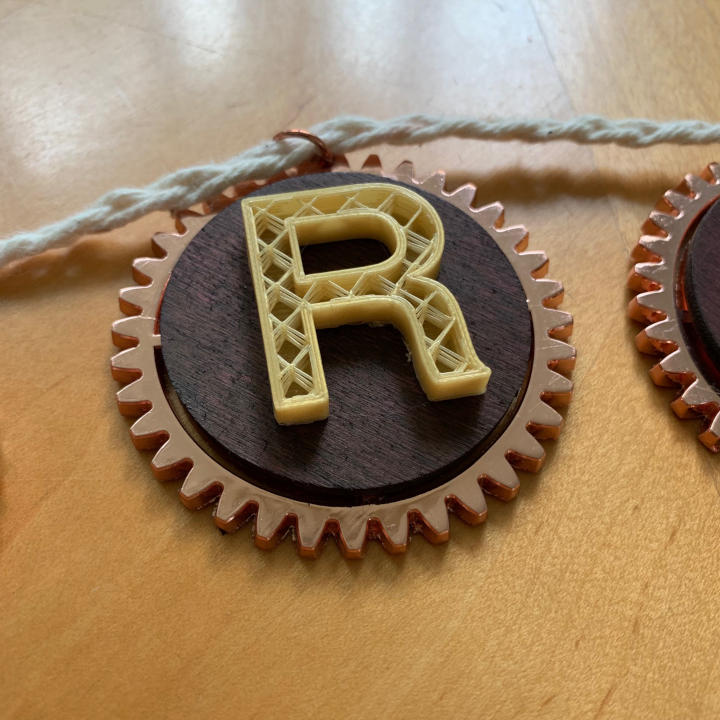
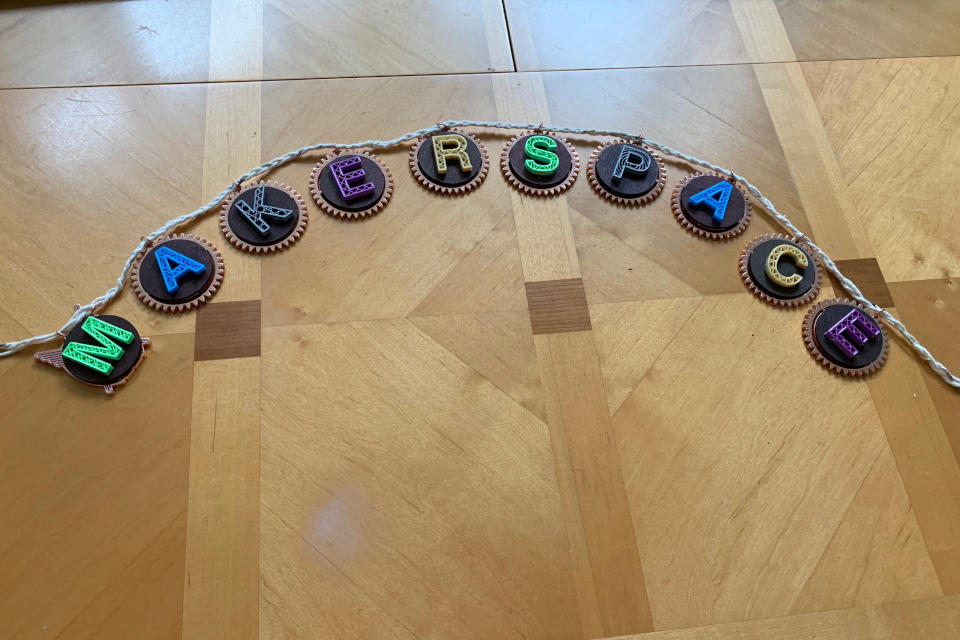
Recently, I was asked to help make ‘MAKERSPACE’ letters for a sign for a makerspace classroom. Emphaszing the process of 3D printing, I chose to expose the infill of each letter. I made a CAD model of each letter in FreeCAD, using the clearest font known to man, Helvetica. Being a Mac user, I had access to the TrueType for the true font, not the Arial knockoff. As I wanted the infill to be clearly visible in the final prints, I chose to use the Bold version for the wider stroke width.